Industry: Education Technology
Client: Panorama Education
Application: Figma
Panorama Education lacked a formalized design system. Components were rarely utilized and the product suffered from inconsistent patterns and many accessibility issues.
Design
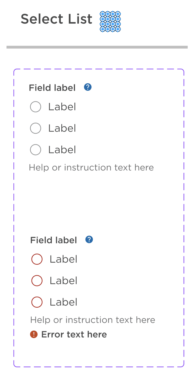
The team was transitioning to Figma so I took this opportunity to evaluate and redesign every element from the ground up in a new Figma Design System Library.
Accessible Building Blocks
It's crucial to start with an accessible Design System. My first step was to check each component for proper color contrast for legibility and to include tips and tricks throughout the Design System to increase awareness and education.
Atomic Design
I implemented atomic design into our Design System to improve our UX maturity.
Collaboration
Collaboration was vital for ensuring that we were using a shared language and understanding across the Digital Technology teams. I worked very closely with our software engineers to validate that the new Design System was intuitive and translated well to code. I also involved Project Managers to align to our business goals with our updated components.
Guidance
In order to ensure everyone has access to the proper governance of the Design System, I utilized our confluence space to document design best practices, accessibility guidelines, and tips and tricks to help get started. This allows for living documentation as we continue to mature our Design System and guidance.
Panorama Design System overview
Color palette accessibility guidelines
Errors & validation guidance


